UX for Legal Claim Funnels

UX for Legal Claim Funnels
Legal claim funnels are one of the trickiest UX problems on the web. On the surface, they look simple: a few questions, a bit of logic, then a lead capture. But anyone who has actually worked on a legal claim funnel UX project knows it is nothing like a normal form flow. People are not just “filling in details”. They are trying to work out if something bad that happened to them actually counts, whether they are eligible for compensation, and whether they can trust the website asking them all these questions. That mix of uncertainty and scepticism changes everything about how these funnels need to be designed. In 2026, the difference between a high-converting funnel and a leaky one usually comes down to how well it handles emotion, trust, and decision fatigue, not just how “clean” the UI looks.
Users don’t behave like leads
It is still common to see legal lead generation websites designed as if users arrive in a rational mindset, ready to complete a process. They are not. Someone entering a compensation or accident claim funnel might be: Unsure if what happened to them is “serious enough” Worried about being judged or dismissed Nervous about legal consequences Distracted or emotionally drained On mobile, in a rush, or multitasking In medical negligence or financial claims, there is often hesitation baked in before the first click. So when a funnel treats users like data points, they leave. Not because the offer is bad, but because the experience feels cold or extractive. Good conversion-focused UX in this space starts by acknowledging a simple truth: hesitation is normal.
The biggest mistake: removing too much friction
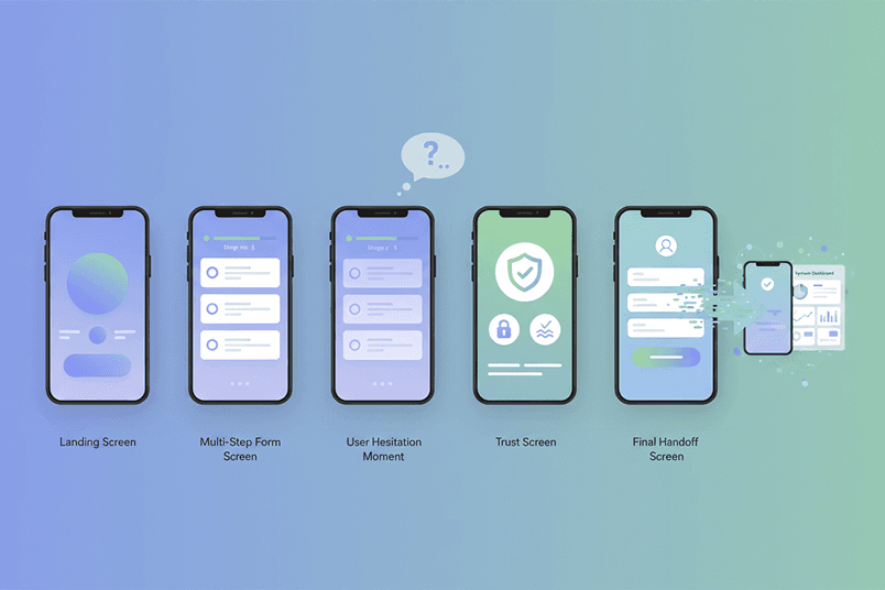
There’s a strong belief in CRO that fewer steps always means better conversion. That’s not true for claim qualification forms. If a funnel feels too quick, users often assume it is a scam or low-quality lead bait. Especially in legal contexts, speed can actually reduce trust. We see this a lot in: Accident claim funnels that jump straight to “Get your results” Debt claim flows that ask for phone numbers immediately Housing claim forms that skip context and go straight to contact capture Users don’t trust shortcuts when the topic is serious. In fact, a bit of structured friction often helps. It signals that the process is real, considered, and legitimate. The goal is not removing friction. It is removing confusing friction. Question order matters more than copy. Most funnels fail not because of bad design, but because of bad sequencing. In a strong multi-step form UX, questions should follow how people naturally think about their situation: What happened? When did it happen? How serious was it? Does this match anything we can help with? Only then: contact details A lot of funnels do this backwards. They start with name, email, phone. That feels like a sales trap, not a helpful tool. Especially in sensitive areas like: Medical negligence claims Debt and consumer claims Accident and injury claims Users need to feel understood before they feel “processed”.
The contact form problem nobody fixes properly
Asking for contact details too early is still one of the biggest conversion killers in legal marketing funnels. It creates a mental shift: From “Am I eligible?” To “What are they going to do with my data?” Once that switch happens, drop-off increases sharply. A better pattern is: 1. Let users complete at least 60–80% of the funnel first 2. Show them a meaningful outcome or eligibility insight 3. Then ask for details as a next step, not an interruption In 2026, users also expect some kind of “result preview” before handing over data. Even a simple eligibility summary increases completion rates. AI is starting to improve this further by generating plain-language summaries like: “Based on your answers, you may be eligible to make a claim. Your situation matches similar cases we’ve seen.” That moment builds trust far more than any badge or disclaimer.
Mobile-first isn’t optional anymore
Most mobile-first funnel design problems come from teams still designing desktop flows first. On mobile, everything is more sensitive: Attention span is shorter Typing is more effortful Errors feel more frustrating Loading delays feel longer than they are A good mobile claim funnel should feel like a guided conversation, not a form squeezed onto a small screen. That means: One question per screen where possible Large tap targets (thumb-friendly UI) Minimal typing (use buttons, sliders, selections) Sticky or obvious next actions Fast transitions between steps If users need to pinch, scroll excessively, or think about where to tap next, you are already losing conversions.
Why people abandon claim funnels
Most drop-offs are not random. They happen at predictable moments: First request for personal data Unexpected or confusing questions Long blocks of legal text Slow transitions or loading states Repetition of similar questions Feeling “unsure what comes next” There is also a quieter killer: cognitive fatigue. If a funnel asks too many small decisions in a row, users stop caring halfway through. Not because they disagree, but because it becomes mentally tiring. This is especially true in: Compensation claims Housing disrepair claims Finance and mis-selling claims The UX has to pace the experience like a story, not a spreadsheet. Trust isn’t built with badges anymore. Old-school trust signals like: “Secure SSL” Generic award logos Stock “approved partner” icons …are mostly ignored now. Users have seen them too many times. In modern legal claim funnel UX, trust comes from consistency: Does the tone stay stable across steps? Do questions feel relevant, not random? Does progress feel honest? Does the flow behave predictably? If something feels “off”, users leave, even if they can’t explain why. A funnel that feels calm and structured will outperform a visually flashy one almost every time.
Conversational UX is changing everything
Chat-style funnels are becoming more common, especially in legal lead generation websites. But here’s the truth: chat UX is not automatically better. When done badly, it is slower and more frustrating than a form. When done well, it feels like guidance rather than interrogation. The key is pacing: Fast enough to feel responsive Structured enough to feel reliable Flexible enough to handle unclear answers AI is pushing this further. Users now expect systems to understand natural language like, “I had an accident at work but I’m not sure if it counts”, instead of forcing rigid input fields. But there is a line. If the AI feels too “clever”, users get uneasy. Especially in legal contexts where trust is fragile. Progressive disclosure is your best friend. The best claim qualification forms don’t ask everything upfront. They reveal complexity slowly. That means: Start simple Increase detail gradually Only show relevant questions Hide unnecessary paths entirely This is where dynamic logic matters. For example, if someone says their issue happened “over 5 years ago”, you don’t need to ask detailed recent timeline questions. Yet many funnels still do, because they are built as static flows rather than adaptive systems. That’s where modern low-code and no-code funnel builders help, but they also introduce limitations when logic gets too complex.
Accessibility affects conversion more than people think
Accessibility is often treated like compliance, but in funnels it directly impacts conversion. Poor accessibility causes: Confusing focus states Missing labels Low contrast text Screen reader issues in multi-step flows Hidden or disappearing context (like placeholder-only labels) And here’s the important bit: accessibility issues don’t just affect disabled users. They increase hesitation for everyone. If a user has to “figure out” the interface, they are more likely to leave.
Funnels are getting smarter (and more adaptive)
AI is quietly reshaping high-converting lead funnels. We are moving towards: Adaptive question flows based on early answers Real-time eligibility prediction Personalised question sequencing Instant summarisation of user input Backend lead scoring before submission But there is a risk. If a funnel feels like it knows too much too quickly, users get uncomfortable. So the challenge is balance: helpful, not invasive. The future is fewer forms, more guided systems. Traditional multi-step forms are slowly being replaced by hybrid systems: Chat-based qualification AI-assisted eligibility checks Dynamic question engines API-driven instant scoring systems But the core UX problem remains the same. Users are not trying to “complete a funnel”. They are trying to answer a personal question: “Do I have a case, and what should I do next?” The best funnels in 2026 won’t feel like marketing tools at all. They will feel like clear, structured guidance that happens to result in a lead.
Where good funnels actually win
Designing conversion rate optimisation for legal marketing funnels is not about squeezing more leads out of traffic. It is about building a system that respects hesitation, reduces uncertainty, and helps users feel confident enough to continue. If the UX gets that right, conversion follows naturally. If it gets it wrong, no amount of A/B testing will fix it.
Related Insights

·
3 min read
Why AI Agents Fail Without Product Structure

·
5 min read
Good UX is System Design, Not Interface Design

·
3 min read
No-Code Works… Until Systems Start to Scale

·
7 min read
AI Is Becoming The Expensive Option

·
8 min read
Accessibility Is Product Quality

·
3 min read
Why AI Agents Could Outperform Classic APIs

·
3 min read
Redefining UI/UX Design Seamlessly

·
3 min read
No-Code Tools: The Double-Edged Sword of Modern Development